I don’t know about you but I L-O-V-E the holiday season. I love pulling my sweaters and scarfs out of the top shelves of my closets. I love the holiday movies, baking, holiday parties and, of course, decorating! I think is really important to not feel bound to the typical red and green holiday color scheme. Here is a classic example…
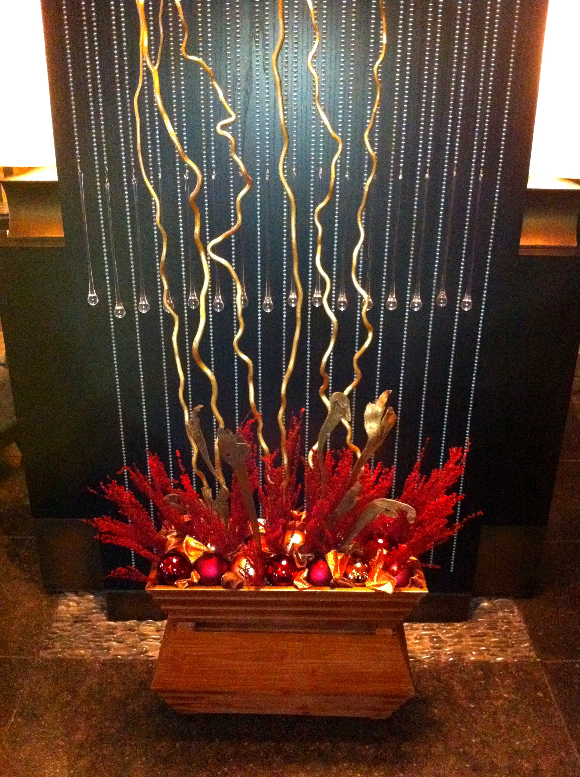
Last week, I had the pleasure of working with David Hahn to install the holiday decor at the new Palomar San Diego. Kimpton Hotels has taken over, what was formerly known as Hotel Se, and has brought it back to life. The design has always been beautiful but with a brilliant group like Kimpton Hotels, the properties’ future is promising. The hotel has a very masculine design and color scheme…copper, silver, black, dark red…we knew we couldn’t put a traditional holiday design in such a modern/contemporary space. So we choose gold and copper as our main focus, with chocolate and cranberry as accent colors.
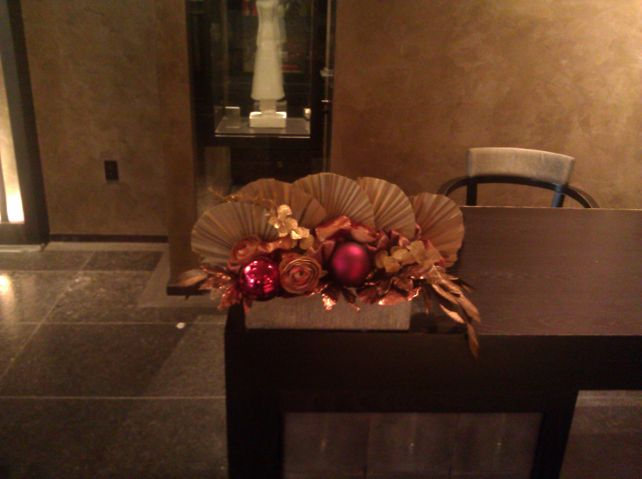
We created two large lobby pieces. We used various branches ( I especially love the moose branches…well they look like moose antlers!), some cranberry foliage and cranberry ball ornaments. The lobby has a big cranberry wall so we wanted to tie it into the design.  We had to come up with arrangements for the concierge desk, lobby coffee tables, etc. Again, it had to be something modern. Inspired by what looks like Chinese parasols hanging from the lobby ceiling, we incorporated these beautiful fans into our holiday arrangements.
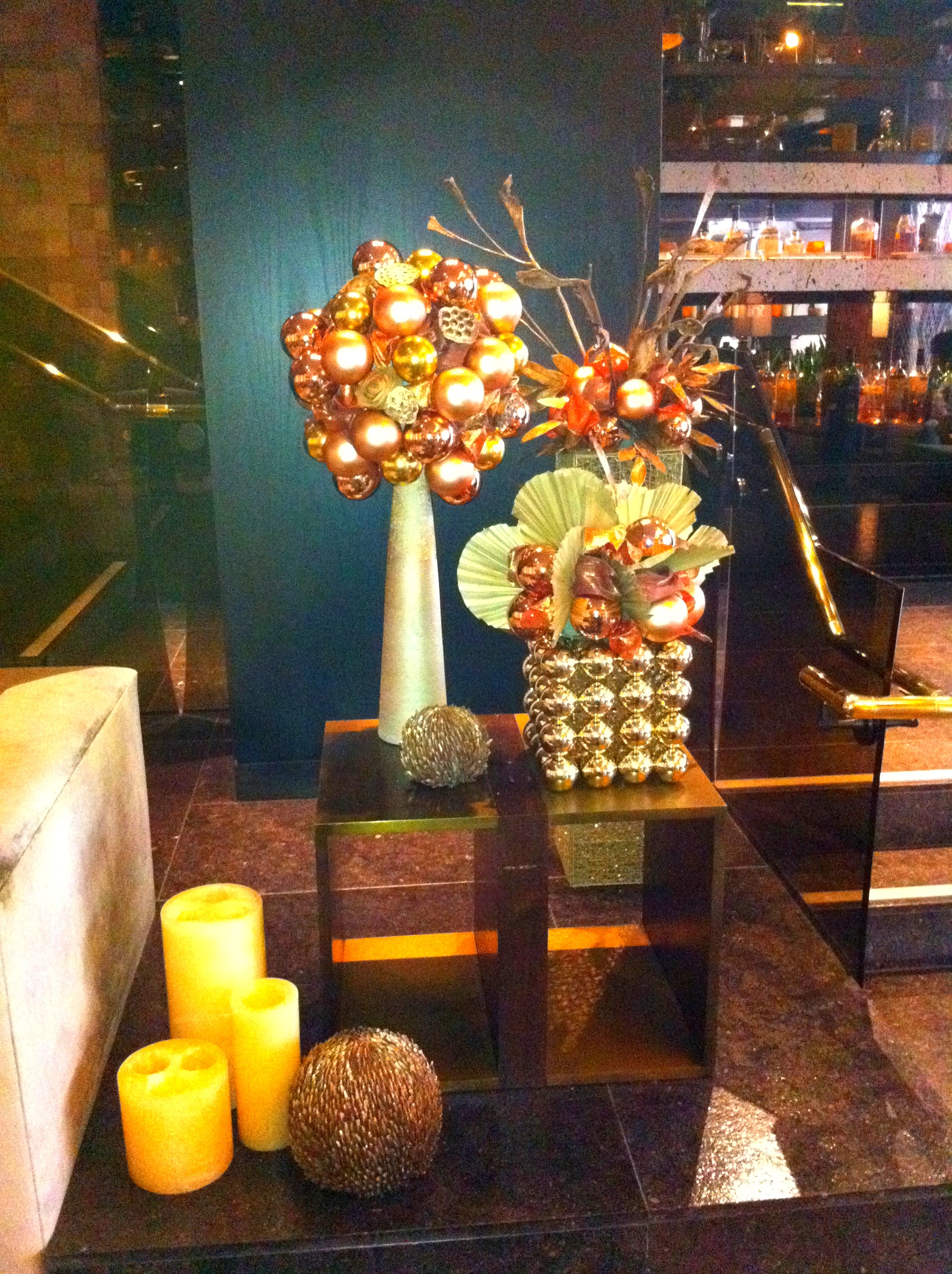
We also did vignettes. Here is an example of one. I love this one!!!
If your house consists of colors like dijon, carmel, camel, chocolate…don’t be afraid to use the color scheme above. You don’t have to stick to red and green! If your home is designed in turquoise, sapphire and silver, turn your house into a winter wonder land using only white and different tones of blue. Let your holiday decor be an extension of the design already present in your house. And most important, have fun with it!


